What Is a Monogram? Choose Initials and Make a Useful Small Logo
Understand monograms, choose initials, compare spacing and small-size readability, and create a local logo or an AI design candidate.
A monogram combines initials into a recognizable mark. It can identify a person, a business or a product without spelling out the full name inside every small image. The useful question is not whether the letters look decorative, but whether they remain distinct where the mark will appear.
The monogram logo maker provides a local workspace for one to three initials, enclosure, color and spacing. You can export a design without an account, then use the AI Monogram preset when you want to explore another composition.
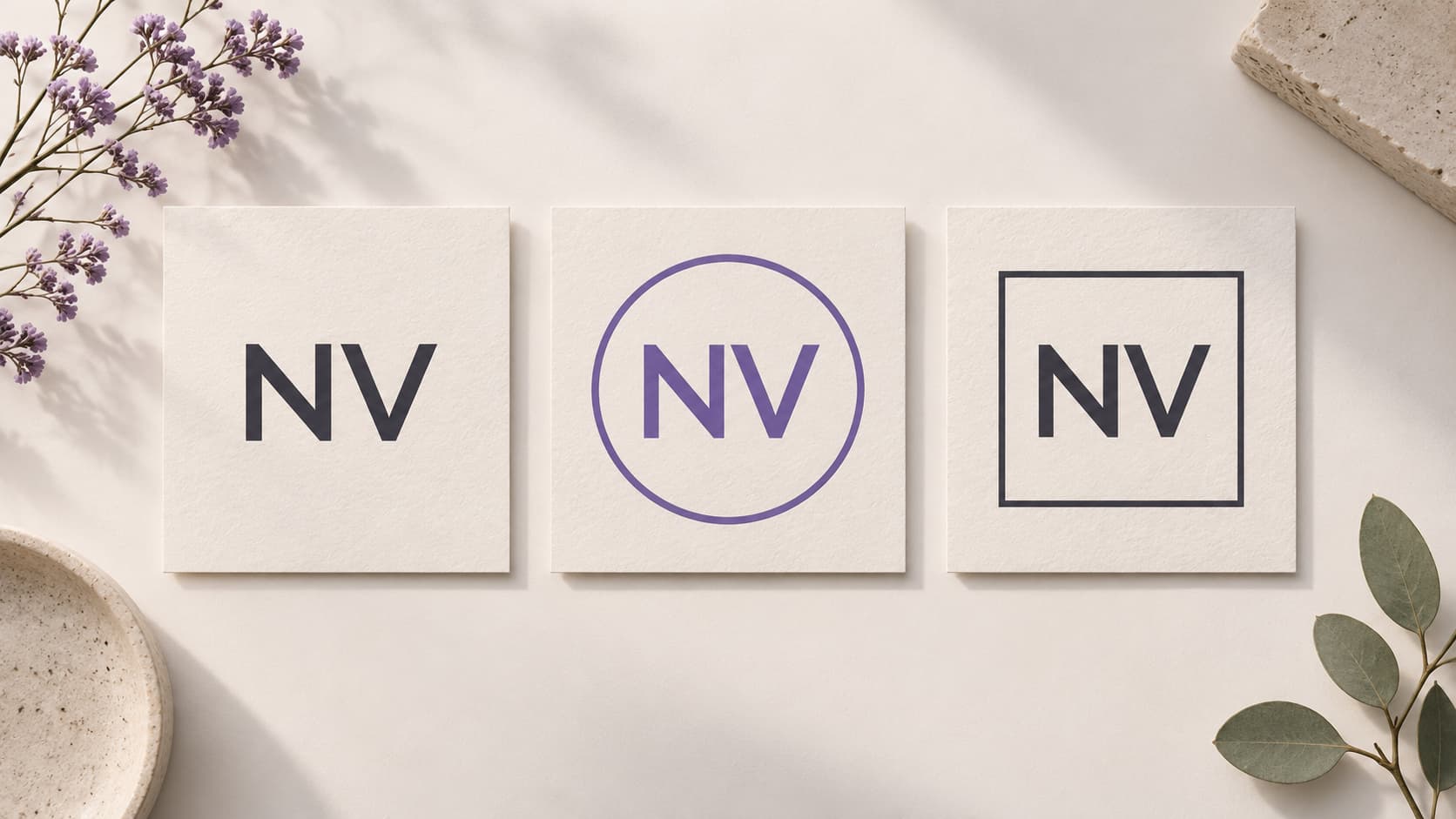
Illustration: an original generated NV design study showing three enclosure treatments. It illustrates the concept rather than an exported tool result.
Choose initials that belong to the identity
For a personal mark, start with the initials you already use professionally. For a product, consider the first letters of the product name. Do not add extra letters simply to make the shape symmetrical: people still need to associate the mark with the name.
Write the full name beside the initials while reviewing. An attractive arrangement can accidentally reverse reading order or make one letter look like another. If you use a script your audience is unfamiliar with, keep a readable name nearby in the larger identity system.
One letter can be sufficient. Two letters allow more relationships between strokes. Three can still work, but the space needed by each character becomes more important. The local tool limits the monogram output to the first three grapheme clusters so combined characters can remain intact.
Start with separation before interlocking
Place the letters clearly before trying to merge them. Check the empty areas inside and between strokes. If two letters share a line, make sure both are still readable; a clever connection is not useful when it erases the identity.
Try an original local example such as NV, then replace it with your own initials. Compare the circle and square enclosures, or remove the emphasis on a decorative outline by selecting a plain font style. These are design exercises, not examples of customer results or proof of improved engagement.
Compare a monogram with a wordmark
A monogram is compact but asks the audience to learn its association. A wordmark spells out the name, which can be helpful in a header or document. You do not have to force the same amount of text into an avatar, application icon and large website masthead.
Use the text effect generator to compare the full name with the short mark. Make the comparison at the same display size. If the full name becomes a narrow line, it may belong beside the icon rather than inside it.
For an application, inspect the monogram in App Icon Maker too. Platform masks can change the apparent spacing between the letters and the edge even when the unmasked square looks balanced.
Check the actual small-size reading
The 64, 32 and 16 px previews help reveal different weaknesses. At 64 px, inspect letter relationships. At 32 px, look for collapsed gaps and thin strokes. At 16 px, decide whether a simplified version is needed for that particular destination.
Do not make every version more complicated to justify the largest image. You can keep a detailed mark for a large presentation and use a simpler treatment where space is limited. Record which file belongs to which use so another contributor does not replace the small version with the wrong source.
Choose color and background together
Test the mark on the background it will actually use. A pale stroke that looks delicate on a dark preview may disappear on a light document. Conversely, a dark mark inside an opaque light square will not become transparent just because the surrounding page is dark.
The local workspace can create a transparent canvas and export PNG. Inspect the downloaded file, especially if the design will sit over several backgrounds. SVG preserves editable text, so its appearance can depend on the fonts available to the viewer. PNG fixes the raster appearance from the export.
Use AI for a new candidate, then review the letters
The AI Monogram preset requires the real brand name. Describe the intended initials, arrangement and degree of simplicity. Review the displayed credit price before confirming the task.
Compare the generated lettering with the name you supplied. AI can suggest an interesting connection while also changing a letter. Treat the result as a candidate to inspect, not as a guaranteed typographic construction or a vector master.
Questions about monograms
Must monogram letters overlap?
No. They can be separated, combined or interlocked. The design should make their relationship readable rather than satisfying a decorative rule.
Can a monogram use non-Latin characters?
Yes. Check how the actual characters render on your device and how your audience reads them. Export PNG when you need to preserve a particular appearance.
Does a monogram prove the mark is unique?
No. Initial combinations are shared by many people and businesses. Review conflicts and any registration requirements separately from the local design export.
Make the compact mark serve the name
Choose meaningful initials, preserve their reading order and inspect the downloaded result at the intended size. Start with the free monogram workspace, then expand the design only when its use calls for it.
Author

Categories
More Posts
Emblem Logo Design Guide: Build a Badge That Still Reads Small
Design an emblem with a useful enclosure, readable name and simple focal mark. Compare small versions and prepare practical exported files.
Add a Generated App Icon to Xcode: Asset Catalog Import and Checks
Import an AppIcon.appiconset into Xcode, select the correct target asset, and investigate missing images, alpha and stale app icons.
YouTube Logo History: The 2017 Redesign and Its Small-Screen Lesson
Explore YouTube’s documented 2017 logo redesign, the relationship between icon and wordmark, and lessons for an original channel identity.
Newsletter
Stay Updated
Get the latest app design tips and icon trends delivered to your inbox.