YouTube Logo History: The 2017 Redesign and Its Small-Screen Lesson
Explore YouTube’s documented 2017 logo redesign, the relationship between icon and wordmark, and lessons for an original channel identity.
One useful chapter in YouTube logo history is the documented 2017 redesign. It shows why an identity can need both a compact icon and a readable name. This guide focuses on that official milestone and practical design lessons, rather than inventing a timeline of every asset revision.
For a channel creator, the task is to develop your own identity. The YouTube logo workspace helps inspect it as an avatar and watermark; it does not supply the official YouTube mark for your channel.
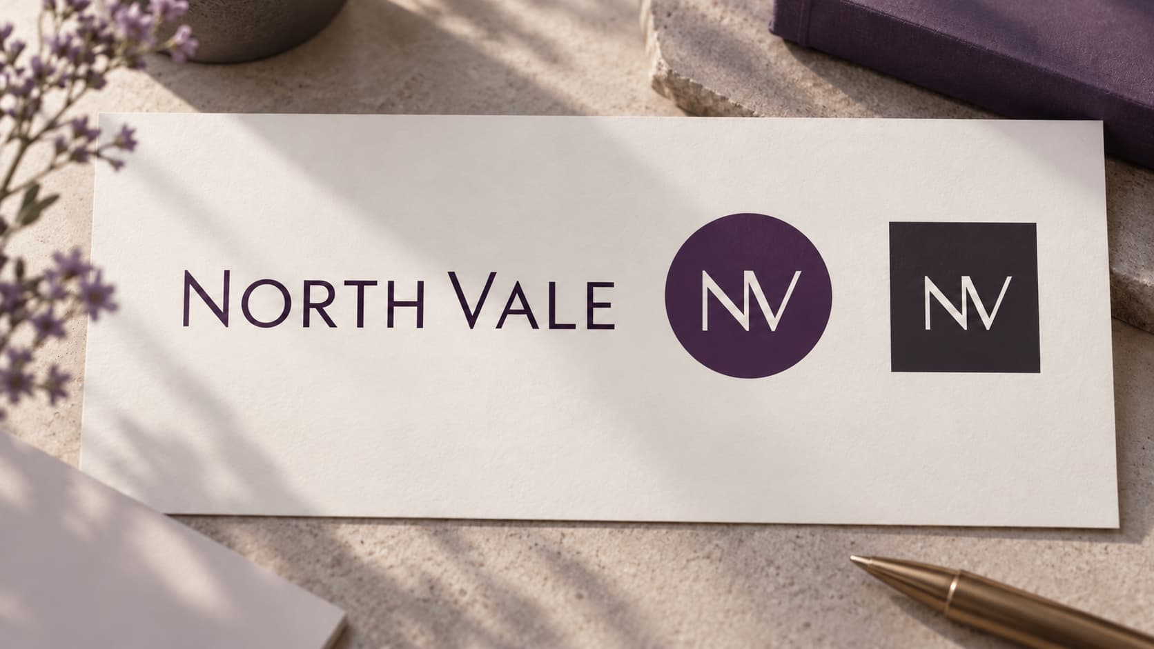
Illustration: an original generated concept, not a screenshot, customer result or platform validation record. The fictional design study is not official historical brand artwork.
The documented 2017 change
In its August 29, 2017 announcement, YouTube introduced a refreshed logo and icon alongside an interface update. The company described a cleaner wordmark combined with an icon usable in limited space, in the context of screens of different sizes.
That explanation supports a specific lesson: the full name and compact icon can be related parts of an identity. It does not establish a measured result for an independent channel, or prove that separating a symbol always improves clicks.
Give the compact mark and full name different jobs
A channel avatar often appears in a small circle next to content. A full name can appear in the channel heading or larger material. Design each for its available space instead of squeezing all the same letters into every image.
Try a fictional exercise with a name such as North Vale. Make one readable wordmark and one compact original mark. Place them together at a comfortable size, then inspect the compact mark at avatar size. Record where the full name belongs instead of expecting the symbol to explain everything.
This is an original design exercise, not a reproduction of YouTube’s logo or a claim that the fictional channel exists. Its purpose is to test related assets for your own project.
Keep the relationship without identical files
Choose a few decisions to connect the assets: subject, stroke character or palette. A wordmark and avatar can look related even when their layouts differ.
Then adjust the destination details. A square avatar needs a focal symbol that survives the circular crop. A longer wordmark needs readable spacing. A watermark needs a simple image that remains clear over video content.
The text effect generator compares the full name, while the monogram tool explores a compact initial mark. Review the actual files, not only a presentation that surrounds them with a large mockup.
Check the avatar in its real shape
Do the circular crop check before final export. Useful parts near the square’s corners can disappear in the circle. Also inspect the small display, where fine lines or a long name can become indistinct.
The YouTube branding help page describes profile and watermark requirements. Use that current guidance for the file you upload. A historical announcement is not the source for today’s upload rules.
Keep a static avatar separate from video animation. The current tool exports avatar or watermark PNGs; the animation page serves another output. A video clip does not become a supported animated avatar automatically.
Make the check repeatable
For each file, record its name, destination and source. Open it at a realistic size. Put a transparent result over its intended backgrounds and confirm the pixels are actually transparent.
If another editor changes the file, inspect that edited version again. Keep an editable source so a contributor can adjust spacing without recreating the artwork from a screenshot.
For AI candidates, compare the generated lettering with the requested name. A convincing presentation can still contain the wrong letter. Choose the artwork deliberately before preparing many platform files.
What this case means for your channel
The official redesign belongs to YouTube’s identity. Your channel has its own audience, name and content. Apply the layout lesson without copying the company’s mark or presenting your project as an official partner.
An avatar also cannot explain an unclear channel description or replace useful videos. Let the visual system support the real content and author identity.
Questions about YouTube logo history
What date does this guide verify?
The company announcement used here is dated August 29, 2017. Consult that record for the milestone.
Should my channel copy the official icon?
Create your own design. Apply the lesson about sizes and related assets without borrowing YouTube’s identity.
Must the wordmark and avatar be the same image?
They can share a direction while using different layouts. Compare each at its intended size and crop.
Turn the lesson into your own design task
Prepare a readable name and compact original mark, test the avatar crop and inspect the final files. Use the channel workspace to evaluate your result.
Author

Categories
More Posts
PWA Icon Manifest Troubleshooting: Paths, Files and Cached Installs
Fix a PWA icon by checking the deployed manifest, image responses, actual sizes and cached installation instead of only changing the favicon.
App Icon Updates: Layers and Platform Resources
Review current Apple and Android icon workflows, separate source design from platform packaging, and update assets without losing useful variants.
Google Play Icon Export Checklist: Inspect the Actual PNG File
Check a Google Play icon’s dimensions, PNG encoding, color space, file size and square artwork before preparing your store listing.
Newsletter
Stay Updated
Get the latest app design tips and icon trends delivered to your inbox.