Instagram Logo History: The Camera Motif and the 2016 Redesign
Review Instagram’s documented 2016 icon change and how a familiar motif, simpler silhouette and color can inform an original app mark.
The 2016 redesign is a documented chapter in Instagram logo history. It connects a familiar subject with a simpler visual treatment. This article examines that milestone and offers original exercises; it does not assign guessed dates to every later marketing asset change.
Use the history to ask better questions about your own symbol. Another product’s logo should come from that product’s name and purpose, rather than recoloring Instagram’s icon.
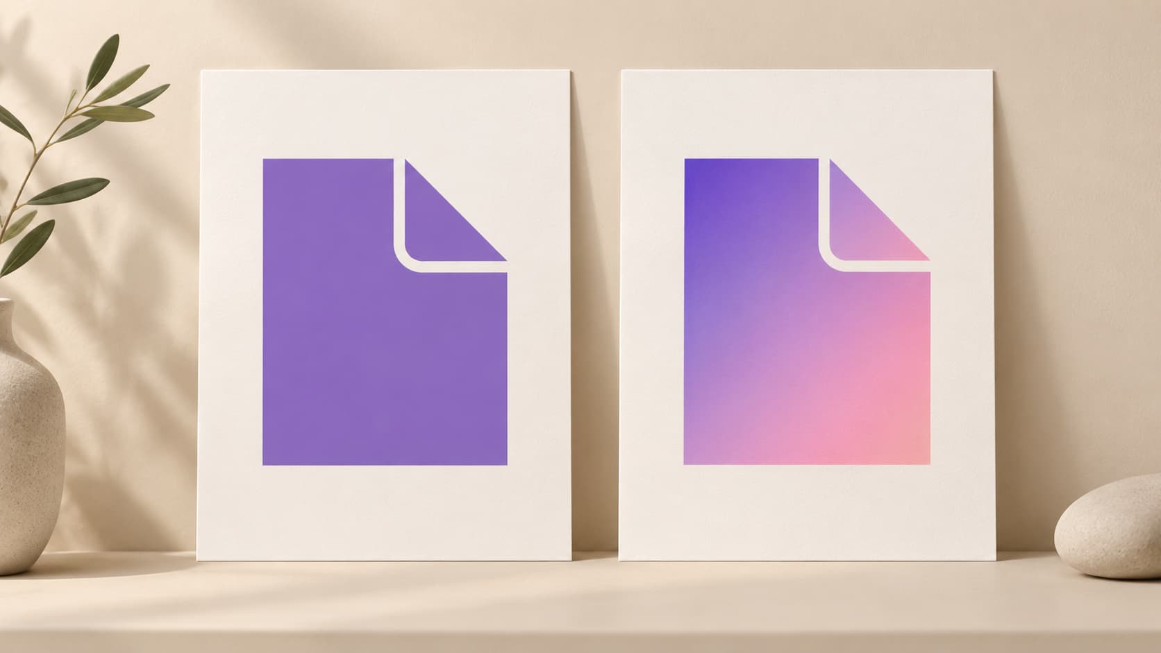
Illustration: an original generated concept, not a screenshot, customer result or platform validation record. The fictional design study is not official historical brand artwork.
What the official announcement records
Instagram’s May 11, 2016 announcement introduced a new app icon and interface. It described a simplified camera motif inspired by the earlier design and a gradient related to its rainbow colors. It also presented coordinated companion-app icons and a quieter interface intended to emphasize shared content.
These are documented statements about Instagram’s design. Claims about changes in installs, revenue or recognition need separate evidence. This guide does not invent those measurements.
Separate the motif from decoration
Choose an original subject for your product: a path, page, orbit or another idea you can explain. Draw its simplest useful version before adding texture, color or materials. Check whether the subject is recognizable in one flat color.
Add a visual treatment and compare it with the plain version. If the treatment makes the subject harder to identify, reconsider the detail. The exercise helps identify which part carries the identity.
A fictional notes app could compare a compact page-like symbol with a shaded version of the same original subject. Label both as design studies. They are neither copies of Instagram’s camera nor the results of a user research experiment.
Check color and silhouette separately
A palette can connect related assets, but it should not be the only cue. Inspect the small mark on the backgrounds it will use. Look for gaps that close and edges that disappear.
Start with a restrained version. A gradient may be smooth in a large source but provide poor contrast at one edge of a small symbol. Adjust the colors or placement to keep the important part clear.
The design tips discuss symbols, text and small-size readability. The original template library provides local examples to modify in a clearly labeled exercise.
Keep a family of assets related
If a product has several tools or modes, choose the rules they will share: stroke weight, enclosure, palette or placement. Give each mark a role without making every image an unrelated illustration.
Compare the assets together at the same size. A set can look consistent in a large presentation but differ greatly when one image uses thin detail and another uses a solid silhouette.
Keep the source of each asset. A future update is easier when the decision is written as a rule rather than guessed from an exported thumbnail.
Prepare platform files after choosing the design
An app icon needs its platform’s mask and resource workflow. A website header can use a different layout. Do not bake one outside crop into every source just because it looked right in a presentation.
Use App Icon Maker to compare previews, then inspect exported resources in the actual project. The iOS and Android comparison explains why a shared core symbol can need different technical assets.
For a new AI interpretation, AI Logo Studio accepts your own brief and approved reference. Review the cost and the actual result. A general description of color or composition should not become a request to duplicate another company’s identity.
Review a redesign as a transition
Record the old source, new source and intended uses. Before replacing files, inspect which application targets, web images and profile assets use them. An identity update involves several destinations, not only a new thumbnail in an editor.
Check the small mark and its context. Turn specific observations about an unclear symbol or unreadable letters into the next task instead of attributing unsupported success to the redesign.
Keep previous sources until replacements are verified. This is particularly useful when an older release or application target still needs an earlier resource workflow.
Questions about Instagram logo history
Which change does this guide cover?
The official icon and interface announcement dated May 11, 2016. Check later materials through current company resources rather than guessing dates.
Is simplification always correct?
Evaluate the actual context. Removing detail can help, but the remaining mark must still communicate a recognizable identity.
Can the same colors make a copied mark original?
Develop a subject and palette for your own product. Assess the whole design rather than relying on recoloring to distinguish a borrowed symbol.
Use the history to refine your questions
Identify the motif, compare plain and styled versions, and prepare checked platform assets. Learn from the documented decision while building your own identity.
Author

Categories
More Posts
What Is a Monogram? Choose Initials and Make a Useful Small Logo
Understand monograms, choose initials, compare spacing and small-size readability, and create a local logo or an AI design candidate.
Add a Generated App Icon to Xcode: Asset Catalog Import and Checks
Import an AppIcon.appiconset into Xcode, select the correct target asset, and investigate missing images, alpha and stale app icons.
Emblem Logo Design Guide: Build a Badge That Still Reads Small
Design an emblem with a useful enclosure, readable name and simple focal mark. Compare small versions and prepare practical exported files.
Newsletter
Stay Updated
Get the latest app design tips and icon trends delivered to your inbox.